America After 3PM
A scroll story about the hours after the school bell — and the 22.6 million children whose parents want afterschool but can’t get it.
Every weekday at 3 p.m. the bell rings and, for millions of families, an unplanned stretch begins before working parents get home. This story takes the Afterschool Alliance’s demand data one figure at a time: how many children want a program, how few actually have one, and how the gap has widened over two decades.
It opens on the number that frames everything — parents of nearly 30 million children want them in an afterschool program, about 77% of all school-age kids. The next scenes narrow that down: only about 7 million are actually enrolled, which a bar chart and then a hundred-square pictogram translate into a single sentence — more than three in four who want afterschool are shut out.
The middle of the story is a trend. A two-line chart runs from 2004 to 2025: participation climbing to a peak of 18% in 2014 and then slipping to 13%, while unmet demand rises the other way, toward half of all non-participating children. The two lines pulling apart is the argument.
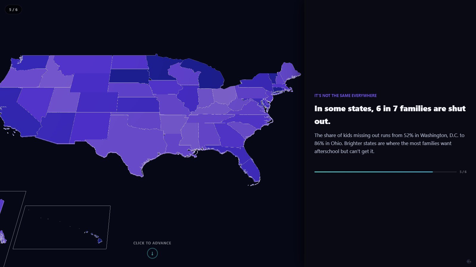
It closes on geography. A choropleth carries the real per-state share of children missing out, from 52% in Washington, D.C. to 86% in Ohio, with the brightest states marking where the most families are locked out. Every state value is the figure the source itself publishes — nothing is estimated to make the map look tidier.
Mechanically this is a scrollytelling build: the 3D scene on the left re-frames as the text on the right advances, the reader sets the pace, and nothing autoplays.
What this one demonstrates
- Scroll-linked camera moves
- One idea (one number) per scene
- Pictogram to turn a ratio into people
- Diverging two-line trend
- Real per-state choropleth from source data
- Chart types
- 3D bar chart, Pictogram / waffle, Multi-series line chart, Choropleth map
- Format
- Scrollytelling · 6 scenes
- Topic
- Society
- Data source
- America After 3PM, 5th Edition (2025) — Afterschool Alliance