CineGraph — Ideas deserve a world. Data becomes sculpture.
Make the chart people stop scrolling for
Turn a spreadsheet into a 3D map or chart people actually stop for — then share it with a link. No code, no design team, minutes instead of days.
Try it free · See What People Made
No account needed · Opens in your browser · Paste your own data
- 3D Maps
- 37 Chart Types
- Share by Link
- Export MP4
Everything Behind a Visual Worth Publishing
A flat chart gets scrolled past. Real 3D scenes, cinematic camera work and a link anyone can open are what make people stop — and none of it needs code.
3D Maps & Charts
37 chart types rendered in real-time 3D, including worldwide maps down to county level. Place charts, text, images and 3D models freely in space — not locked to a flat slide.
Keyframe Animation
Professional timeline with per-object keyframes. Animate position, rotation, scale, and opacity with cinematic easing curves.
Cinematic Camera Paths
Fly through your scenes with smooth Bezier camera paths. Record live camera movement or place keyframes manually.
AI Assembly
Describe what you want — Cinegraph wires up the dashboard, charts, narration, and camera paths for you. AI is the assembler, not the product.
Scrollytelling Stories
Turn your dataset into an NYT-style scrollable story where 3D charts animate as the reader scrolls. Embed it on any site or share a link — no code.
Video & Image Export
Export presentations as WebM video or PNG image sequences up to 4K. Share via link, embed, or download.
Interactive Dashboard
Upload a spreadsheet and get an interactive dashboard to explore it before you decide what the story is.
AI Social Media Hub
Autonomous AI agents research topics, find charts, draft copy, generate visuals, and schedule posts directly to your social media channels.
Start From Something That Already Works
You never start from an empty screen — and you never need an account to find out whether this is for you.
Open a live example
Pick a published visual and open it in the editor. No signup, no blank canvas, no import wizard.
Swap in your own data
Paste your numbers or drop a spreadsheet. The 3D scene, the labels and the camera rebuild around your data.
Share the link
Publish it and post it anywhere. Anyone can open it in a browser, watch it, and remix it with their own data.
Real data, actually published
Every presentation below was built from real data and shared with a link — each has a page explaining how it was made.
-
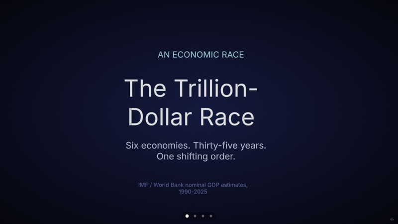
The Trillion-Dollar Race
Six economies and thirty-five years of GDP, run twice — once as a bar chart race with each country's flag riding the bar, once as a line race that shows the shape of the climb.
Economy · Bar chart race, Line chart race · 4 scenes
-
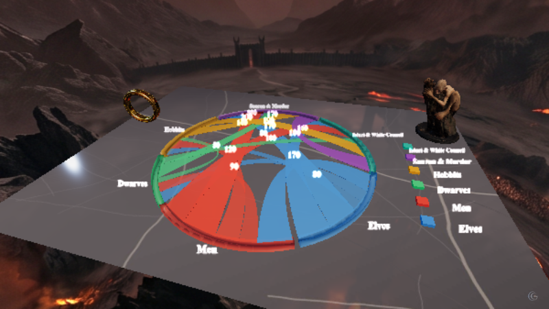
The Lord of the Rings, as a Network
Six factions of Middle-earth and how tightly their stories are woven together, staged in front of the Black Gate with the One Ring itself.
Culture · Chord diagram, 3D model · 1 scene
-
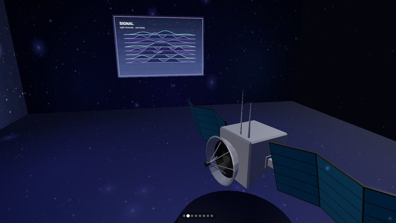
The CineGraph Technology Demo
Eight scenes, two minutes, no dataset to defend — what the engine itself can put on screen.
Technology · 3D bar chart, Pie chart, Radial histogram, Scatter plot, Treemap, Sunburst, Radar chart, Chord diagram, Network diagram, 3D globe map, Elevation heatmap · 8 scenes
-
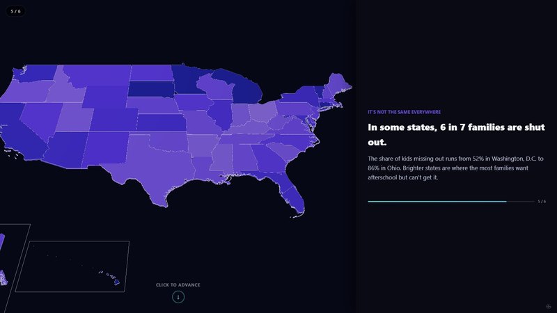
America After 3PM
A scroll story about the hours after the school bell — and the 22.6 million children whose parents want afterschool but can’t get it.
Society · 3D bar chart, Pictogram / waffle, Multi-series line chart, Choropleth map · 6 scenes
-
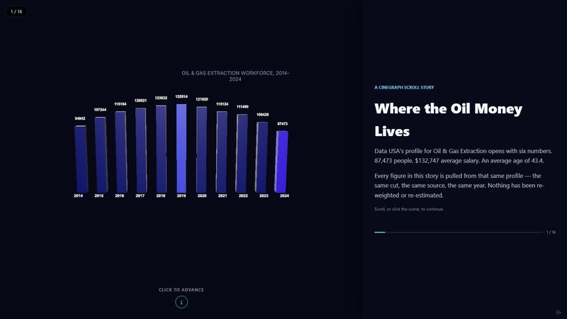
Where the Oil Money Lives
A scroll-driven story that follows one American industry from a shrinking payroll to the counties where its wages actually land.
Economy · 3D bar chart, Lollipop chart, Choropleth map, Pictogram · 7 scenes
-
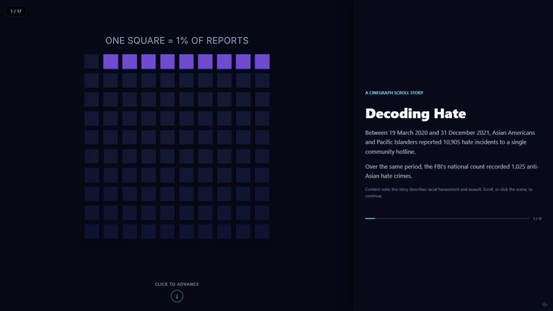
Decoding Hate
What official crime statistics miss, told as a scroll story that starts with the gap between two numbers.
Society · Pictogram, 3D bar chart, Lollipop chart, Choropleth map, Pie chart · 8 scenes
Where the 3D Actually Comes From
Chart tools are fast but flat. 3D software is beautiful but takes days and forgets your data. No single row below is the difference — the difference is doing all of them at once.
- Real 3D Scenes & Maps
- Driven by Live Data
- No Code or 3D Skills
- Built in Minutes
- Embed & Share by Link
- Export as MP4
From Spreadsheet to Something Worth Sharing
Drop in your data, make it into a 3D visual, and share it with a link — free, no credit card, no code.