The Trillion-Dollar Race
Six economies and thirty-five years of GDP, run twice — once as a bar chart race with each country's flag riding the bar, once as a line race that shows the shape of the climb.
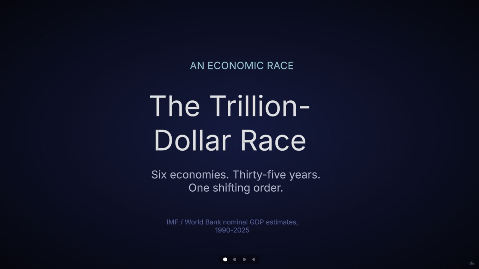
The United States, China, Japan, Germany, the United Kingdom and India, ranked by nominal GDP every five-to-ten years from 1990 to 2025. A bar chart race plays the ranking out year by year — China closing from a rounding error in 1990 to the world's second-largest economy by 2010 — then a second scene replays the same numbers as animated lines, which is where the actual shape of each country's growth (or plateau) becomes readable in a way ranked bars cannot show.
A bar chart race is built for one question: who is ahead, and by how much, right now. It answers that well and almost nothing else — two countries with wildly different growth curves can pass through the same rank in the same year and look identical for a frame. That is the reason this deck plays the same six-country, six-period dataset twice.
The second scene keeps every number but swaps the chart: six lines climb together instead of six bars swapping places. Japan's curve goes essentially flat after 2010 while China's keeps bending upward through the same years — a relationship that a rank list would only ever show as "China moved up, Japan moved down," without the trajectory that explains why.
Nominal GDP is a blunt instrument on its own — it does not adjust for inflation or purchasing power, and the 2025 figures are IMF projections rather than closed-book totals. The deck says so on the title card rather than presenting six-decimal precision the underlying data cannot support.
What this one demonstrates
- Bar chart race with a flag icon riding the end of each bar
- The same dataset replayed as a line race for shape instead of rank
- A calm three-light room built fresh per scene — floor, walls and fill light change between the bar race and the line race
- Screen-facing 2D title cards that stay legible as the camera holds still
- Chart types
- Bar chart race, Line chart race
- Format
- Timeline · 4 scenes
- Topic
- Economy
- Data source
- IMF / World Bank nominal GDP estimates (2025 figures are IMF projections)