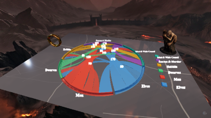
Decoding Hate
What official crime statistics miss, told as a scroll story that starts with the gap between two numbers.
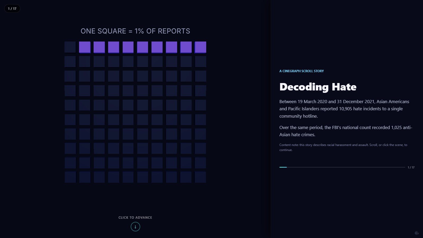
Between March 2020 and December 2021, Asian Americans and Pacific Islanders reported 10,905 hate incidents to one community hotline. Over the same period the national count recorded 1,025 anti-Asian hate crimes. This story is about the distance between those two figures.
It opens with a pictogram — one square per percent of reports — because the argument is about proportion, not magnitude. The official curve comes next, then the shape of what people actually described: verbal harassment, shunning, physical assault, ranked as a lollipop chart rather than a pie, so the long tail stays readable.
The middle of the story is geographic. A US map carries the reported incidents by state, and the pattern is not the one a reader usually expects — it tracks population and reporting infrastructure as much as anything else, which the text says out loud rather than leaving implied.
It closes back on the pictogram it opened with, now filled in. Reusing a single visual form at the start and the end is the cheapest way to make a data story feel like it has a shape, and it costs nothing but a duplicated scene.
This was the first story built on the scrollytelling engine, and it carries a content note in the opening chapter: the material describes racial harassment and assault.
What this one demonstrates
- Pictogram as an opening and closing frame
- Scroll chapters bound to keyframes
- Content note in the first chapter
- Ranked lollipop instead of a pie chart
- Chart types
- Pictogram, 3D bar chart, Lollipop chart, Choropleth map, Pie chart
- Format
- Scrollytelling · 8 scenes
- Topic
- Society