The 100 Largest Cities on Earth
A single frame: one column per city, sized by population, on a world map you can orbit.
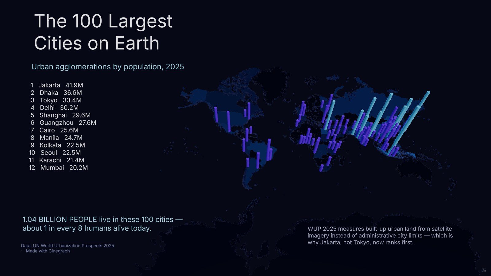
The hundred largest urban agglomerations hold about 1.04 billion people — roughly one in eight humans alive. This is a one-scene piece that makes that concentration visible in a single look, with no narration and no sequence to sit through.
Each city is a column standing on the map, its height set by population. At world scale the top twelve cluster so tightly in Asia that on-map labels become unreadable, so the ranking moved into a text column on the left and the map itself carries no labels. That trade — list on the left, geometry on the right — is what makes the frame legible.
The ranking will surprise anyone carrying older numbers: Jakarta first, Dhaka second, Tokyo third. The 2025 methodology measures built-up urban land from satellite imagery rather than administrative city limits, which reshuffles the top of the table. The scene states that on the frame, because a visualisation that contradicts what a reader believes has to explain itself immediately or it gets dismissed.
Structurally this is the simplest example in the gallery: one scene, one chart, five text boxes. It is a good place to start if you want to see how far a single well-framed 3D scene gets you.
What this one demonstrates
- Column forest on a 3D map
- Ranking list instead of on-map labels
- Methodology note inside the frame
- Single-scene composition
- Chart types
- 3D map, Cylinder columns
- Format
- Timeline · 1 scene
- Topic
- Cities
- Data source
- UN World Urbanization Prospects 2025