The World on Credit
Government debt as a share of GDP across thirty economies — ten of which now owe more than they produce in a year.
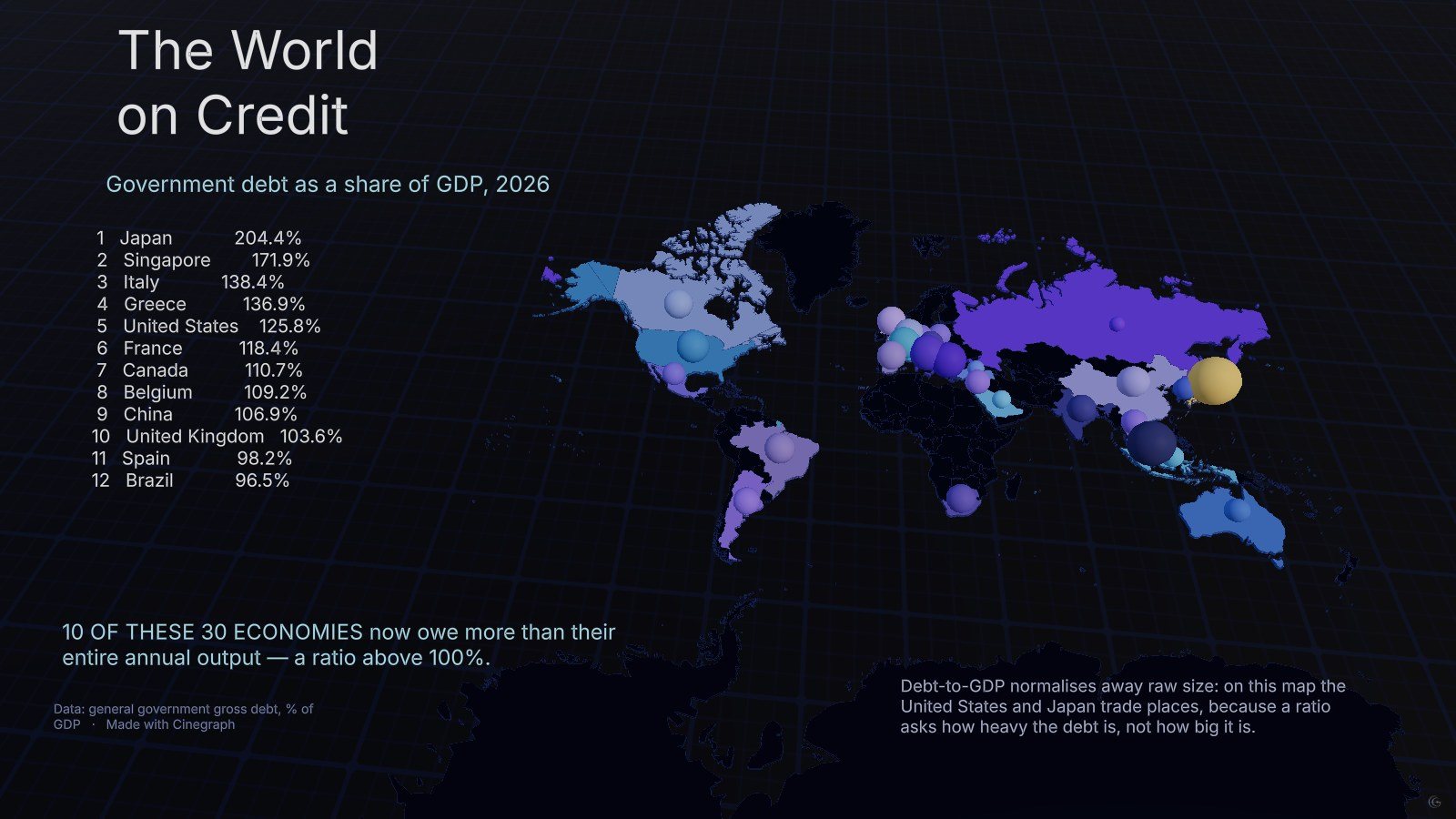
Debt-to-GDP is the ratio that decides whether a debt is heavy, as opposed to merely large. On this map thirty economies are ranked by it, and ten of them sit above 100 per cent.
The ordering is deliberately not the one you get from absolute debt. Japan leads at over 200 per cent; Singapore, Italy and Greece all appear above the United States. A country can owe an enormous sum and carry it comfortably, or owe far less and be stretched — which is exactly what a ratio is for.
Each economy is a sphere anchored at its coordinates, with the twelve heaviest listed on the left so the numbers stay readable while the map carries the geography. The base map is flattened to a single dark tone so the only colour in the frame belongs to the data.
It is a companion to Who Owes the Most, which plots the same countries by the raw size of their debt instead. Opening the two next to each other is the fastest way to see how much a normalisation changes a story.
What this one demonstrates
- Bubble map anchored to coordinates
- Flattened base map so data owns the colour
- Ranked list paired with a map
- Normalised metric as an editorial choice
- Chart types
- 3D map, Bubble map
- Format
- Timeline · 1 scene
- Topic
- Economy