Where the Oil Money Lives
A scroll-driven story that follows one American industry from a shrinking payroll to the counties where its wages actually land.
Oil and gas extraction employs fewer Americans every year and pays the ones who remain extraordinarily well. This story takes a single public profile of the industry and walks through it one number at a time, ending on a map of the places where that money is concentrated.
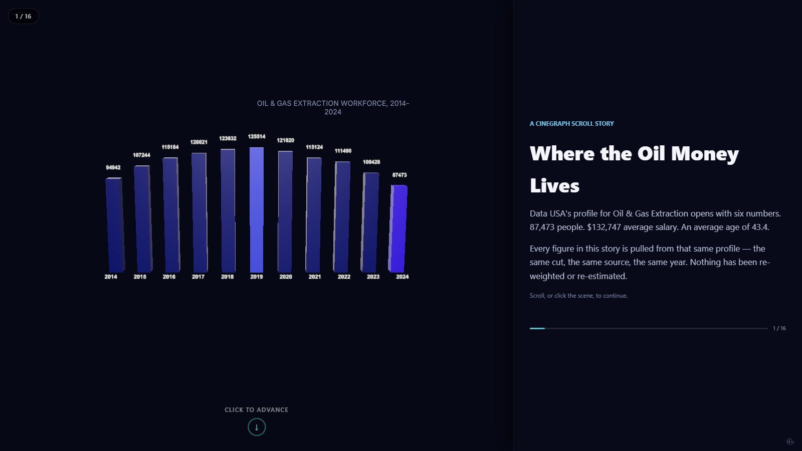
The story opens on the payroll: a bar chart of the extraction workforce from 2014 to 2024, peaking in 2019 and falling to roughly 87,000 people. Every subsequent scene is drawn from that same profile — the same cut, the same year — so the narrative never quietly switches datasets to make a point.
From there it moves to the wage premium, then to how the money spreads across occupations, then down two levels of geography: first states, then PUMAs, the sub-state areas the census uses to describe local labour markets. Watching the same money resolve from a national number into a county-scale pattern is the whole argument of the piece.
Mechanically this is a scrollytelling build. The camera and the chart data are keyed to scroll chapters, so the reader controls the pace: the 3D scene on the left re-frames itself as the text on the right advances. Nothing autoplays and nothing is lost if a reader stops halfway.
What this one demonstrates
- Scroll-linked camera moves
- Chapter-keyed chart transitions
- Two levels of map geography in one story
- Split scroll layout (scene left, text right)
- Chart types
- 3D bar chart, Lollipop chart, Choropleth map, Pictogram
- Format
- Scrollytelling · 7 scenes
- Topic
- Economy
- Data source
- Data USA — Oil & Gas Extraction industry profile