Who Owes the Most
The same thirty economies, sized by the raw weight of their government debt instead of the ratio.
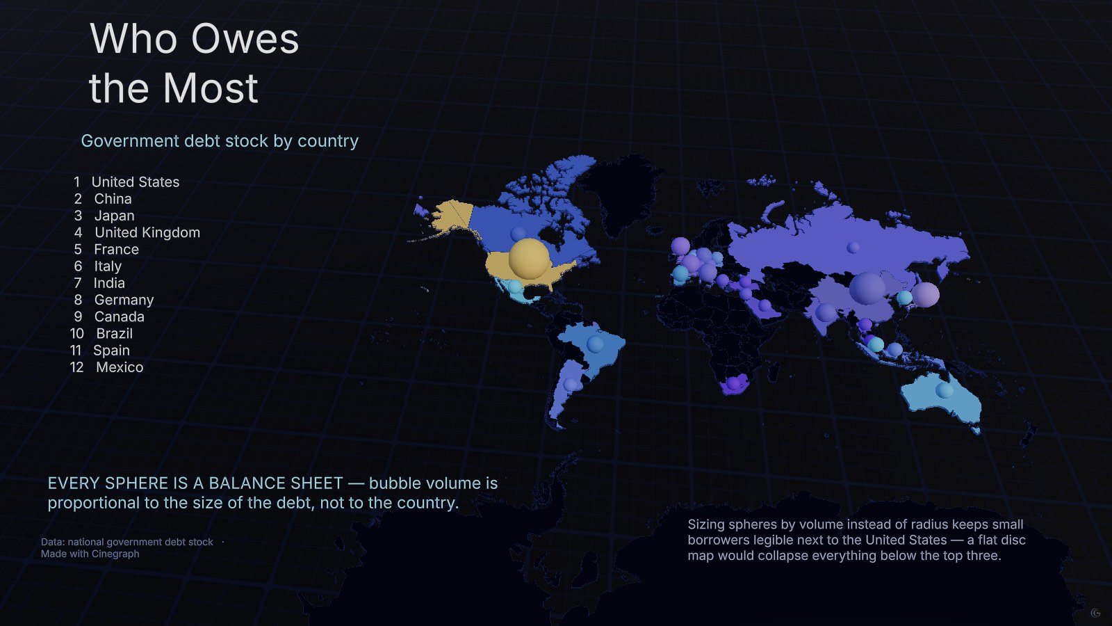
Every sphere on this map is a balance sheet. Bubble volume — not radius — is proportional to the size of the debt, which is what keeps a small borrower visible next to the United States.
Sizing by volume rather than by radius is the entire craft decision here. Encode a value in a circle’s radius and the largest item swallows the frame; encode it in the volume of a sphere and the same range compresses into something a reader can scan. On a flat disc map everything below the top three would have collapsed into noise.
The ranking is the familiar one — United States, China, Japan, then the large European economies — which is the point of showing it beside the debt-to-GDP version. Absolute size and relative burden produce two different maps of the same thirty countries.
Both maps share one country set and one set of coordinates, so they can be read as a pair without a reader having to check whether the sample changed between them.
What this one demonstrates
- Volume-proportional sphere encoding
- Paired stories over one dataset
- Flattened base map
- Ranking column beside the map
- Chart types
- 3D map, Bubble map
- Format
- Timeline · 1 scene
- Topic
- Economy